Product discovery → Store comparison → Fulfilment
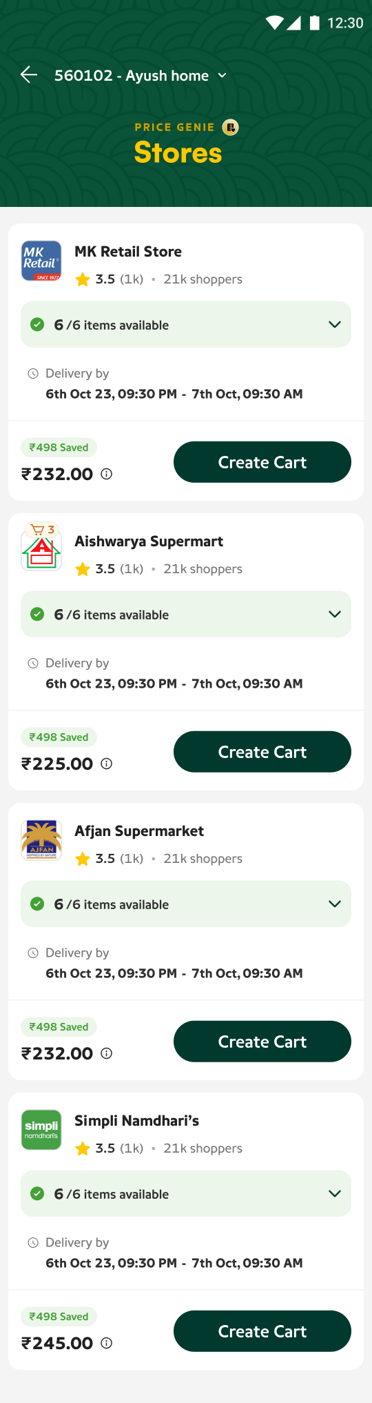
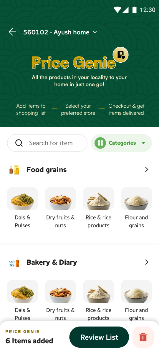
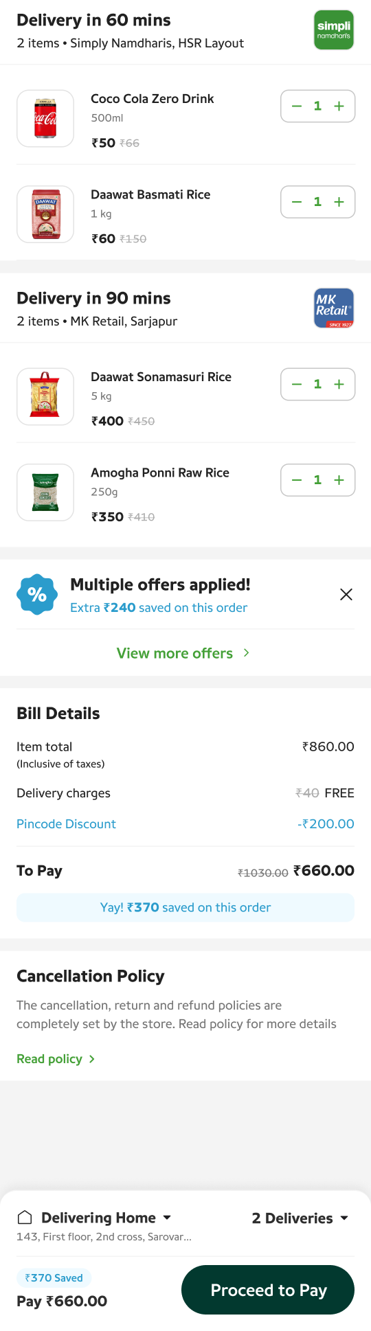
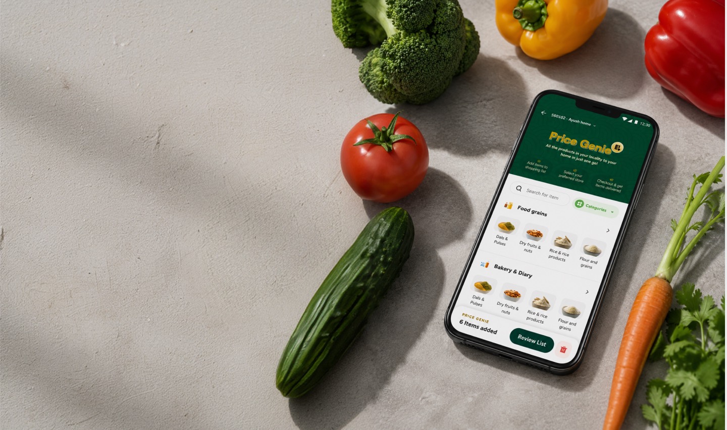
The three surfaces this case study is about: discovering products, comparing fulfilment, and understanding the resulting basket.
02 — Context
Pincode was built around stores.
Pincode is a hyperlocal shopping app. Like most commerce products, it followed the model ecommerce has used for decades: pick a store, then shop inside it. The model worked—unevenly. Whatever a user could discover was bounded by whichever store they happened to open first.
Two categories carried the app. Penetration across everything else stayed low—discovery was capped by the store-first funnel.
Users don’t necessarily care from which store their orders are delivered.
They care about finding the products they need, at a good price, with a good delivery promise. The store is a means to that end—yet it was the first and most binding decision in the flow.
The store-first model was becoming a constraint on product discovery.
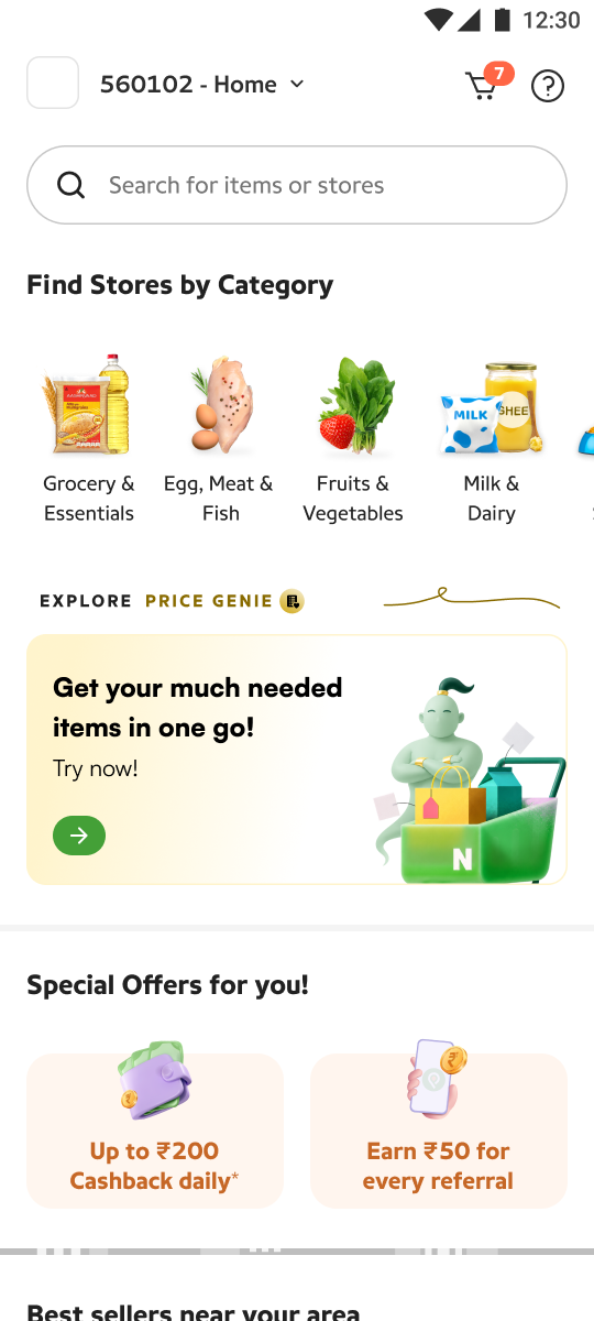
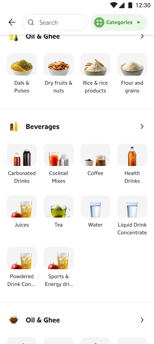
The original entry points: pick a store, or browse a category that still resolves to one store’s shelf.
03 — Problem
The problem wasn’t the cart. It was the shopping model.
Item unavailable
- 01Search another store
- 02Compromise on product
- 03Compromise on price / delivery
- 04Abandon the basket
When users begin by choosing a store, their product discovery is constrained by that store’s inventory. The moment the store doesn’t have something, every path forward costs the user.
None of these are interface failures. A better cart, a better search bar, a better store page—none of them fix a sequence that forces the least-informed decision first. The problem was systemic, and it needed a model-level answer.
Instead of asking users where they wanted to shop, Price Genie started with what they wanted to buy.
05 — Hypothesis
Could item-first shopping help users build better baskets?
Add more of the products people actually need.
If adding an item no longer commits you to a store, the basket should converge on the real shopping list—not the subset one store happens to carry.
Consider multiple stores if it improved fulfilment.
Store loyalty on hyperlocal platforms is thin. Would users accept fulfilment from unfamiliar stores when availability, price, and delivery were clearly better?
Trade store preference for better price and delivery.
The model only works if the comparison surface makes the trade obvious—users won’t abandon a known store for an abstract promise.
Complete larger baskets without increasing cancellations.
Bigger baskets are only commercially healthy if the marketplace can actually fulfil them. Cancellations were the guardrail metric for the whole experiment.
06 — What we measured
We measured three things.
The fulfilment metrics are the interesting ones. Item-first shopping is only viable if enough nearby stores can cover all—or nearly all—of a typical basket. N−1 and N−2 coverage told us how often the model would need multi-store fulfilment to keep its promise.
07 — System
The user shouldn’t have to understand the complexity underneath.
Behind one decision surface, Price Genie evaluates the possible fulfilment combinations across nearby stores—availability, price, delivery, and offers—and presents only what the user needs to choose.
A complex system underneath, a simple decision surface above. Values illustrative.
“Expose complexity only when it helps the user make a decision.”
08 — Interface
The store-agnostic list is where the system begins.
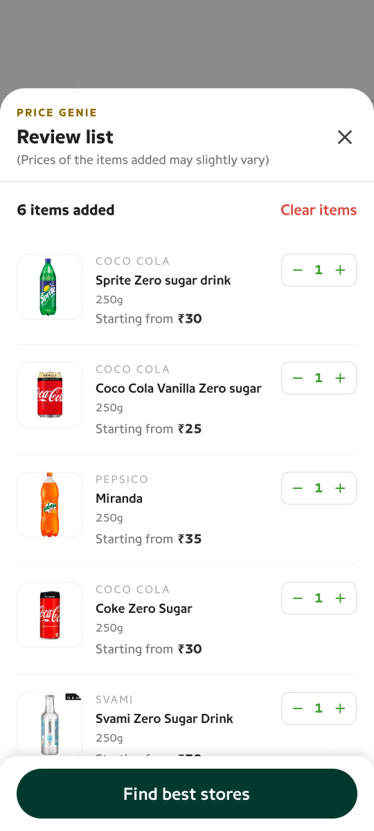
The list is the input the engine evaluates against every nearby store at once.
09 — Design decisions
Six decisions, one principle.
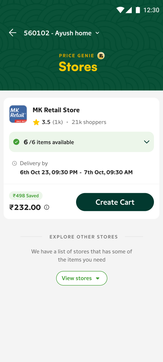
Start with the store that can fulfil the whole basket.
When a store can fulfil 100% of the requested items, we collapse the details and make the fulfilment status immediately scannable.
Users don’t need to inspect six individual products if the store already satisfies the entire basket. The only questions left are when, how much, and what do I save—so those are the only things the collapsed card shows.
Highlighted values are illustrative.
Expand only when comparison is useful.
Partial-fulfilment stores are where users actually have to think. Expanding a store gives them a quick inventory snapshot—which items it has, which it doesn’t, at what price—without leaving the comparison. The card expands in place: comparison is a state of the list, not a separate screen.
Collapsed
Expanded
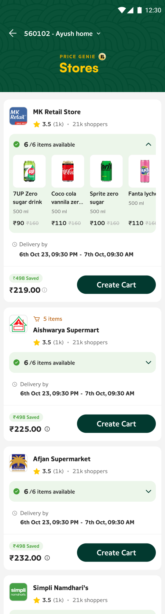
Availability, price and delivery are the primary decision variables—so the expanded state is built entirely from them.
Item-first doesn’t mean store-blind.
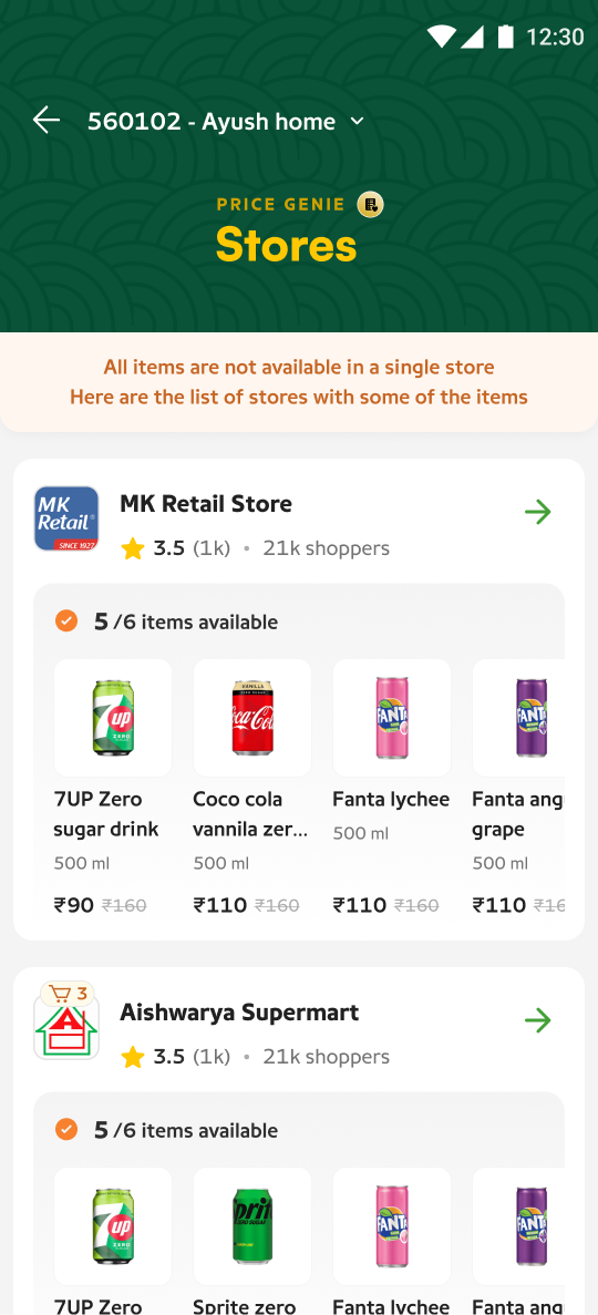
The system could have gone further—fully abstracting stores away and just delivering “the basket.” We deliberately didn’t. Even though discovery begins with products, fulfilment stays transparent. At every step, four things are always answerable:
When something goes wrong—a delay, a substitution—the user needs to know who is responsible for what. A system that hides the fulfilling store buys simplicity now and pays for it in the first support ticket.
Abstract the complexity, not the accountability.
The cart had to stop pretending there was one store.
The multi-store cart is a consequence of the model, not the innovation itself. When no single store can serve the whole list well, the best basket spans stores—and the cart became a representation of how the order would actually be fulfilled.
We grouped by delivery, with the store named inside each group—not the other way around. Delivery time is what the user plans their day around; the store answers “who is bringing it.”
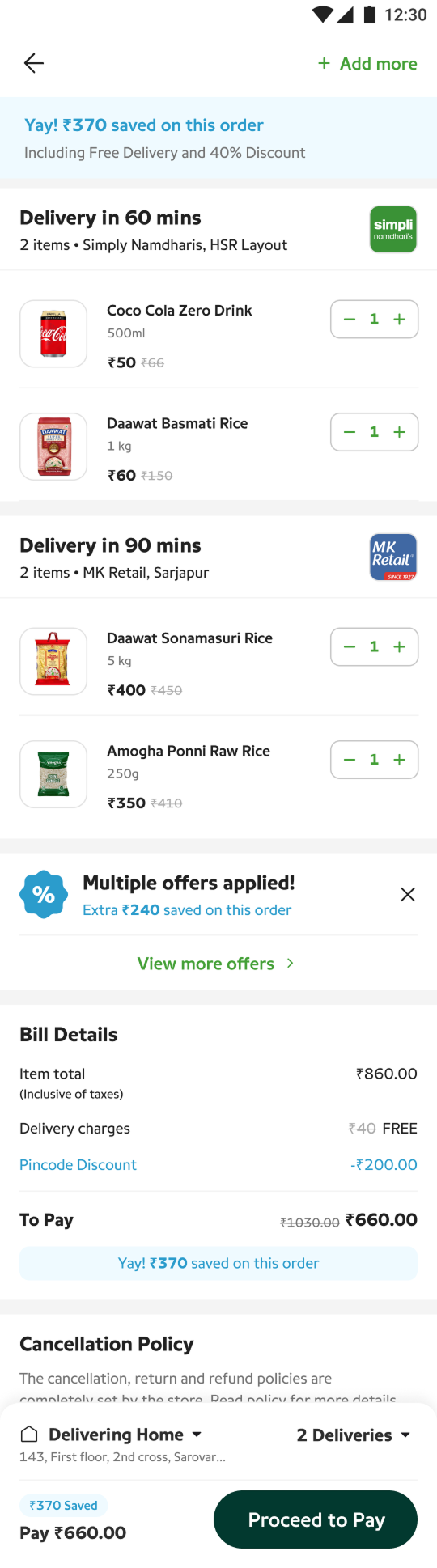
Make delivery complexity visible, but easy to scan.
Users need immediate visibility into three things: where the order is coming from, what arrives when, and which items belong to each delivery. The discipline was in what we didn’t show—routing, store handoffs, slot logic all stayed backstage.
These items.
This store.
This time.
Make the payoff tangible.
When users are comparing stores and fulfilment options, savings become part of the decision. We surfaced value throughout—on comparison cards, in the cart, at confirmation—instead of burying it in the bill. The offer engine stopped being a checkout footnote and became a decision input.
The ₹370 shown is illustrative of the treatment, not a measured result.
15 — The walkthrough
From need, to basket, to fulfilment.
 01
01
Discover products
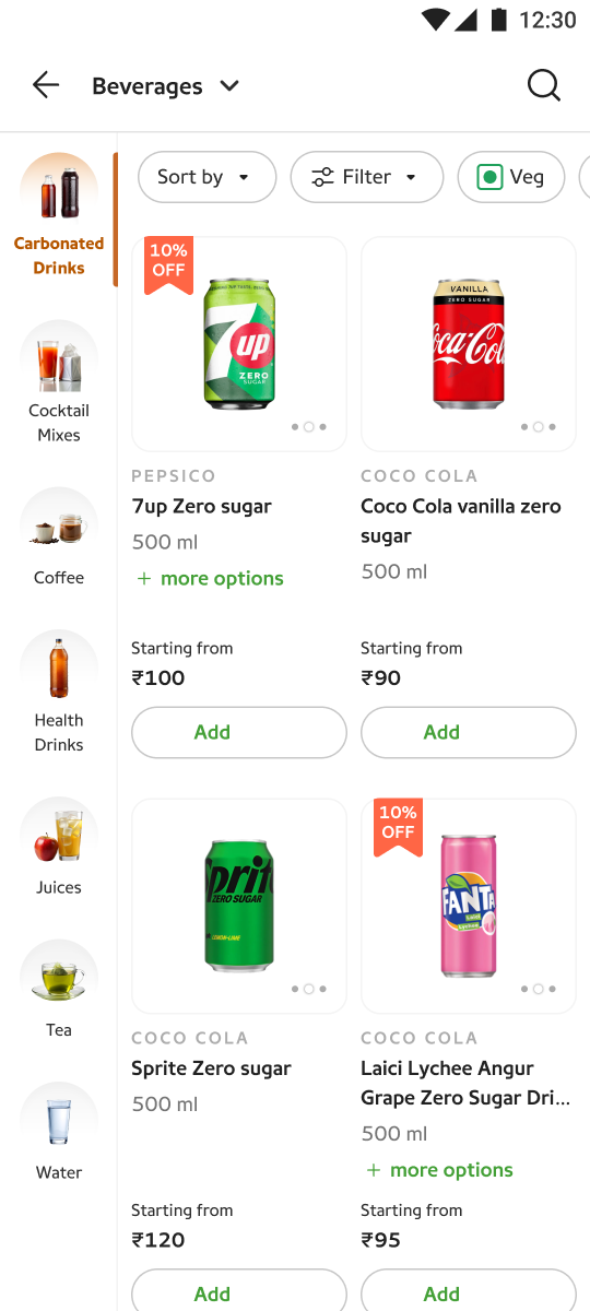
Shopping begins with what you need—browse categories and add products to a store-agnostic list.
02
Compare stores
The system ranks nearby stores by how much of the list they fulfil, at what price, with what delivery.
03
Inspect availability
Expand a store for an inventory snapshot—what it has, what it doesn’t, at what price—without leaving the comparison.
04
Build a multi-store basket
When one store can’t cover the list, the best basket spans stores—grouped by delivery, not hidden.
05
See delivery + savings
Each delivery reads like a promise—these items, this store, this time—with savings surfaced, not buried.
16 — Experiment
We weren’t redesigning a cart. We were testing a new shopping behaviour.
The core question the experiment was built to answer: can item-first discovery increase product discovery without creating unacceptable fulfilment complexity?
I’m deliberately not publishing outcome numbers here. This was an internal experiment, and directional claims without the underlying data would be exactly the kind of portfolio inflation this page avoids. What I can speak to is what we observed while it ran.
Tracked
17 — Learnings
The biggest learning wasn’t about the cart.
Observed
Users care more about finding the right products than choosing a specific store.
Session after session, store choice was instrumental. Users engaged with the comparison surface to complete their list, not to browse merchants.
Observed
Multi-store fulfilment is acceptable when the value is clear.
Users didn’t reject split deliveries outright—they weighed them. When the payoff was visible next to the cost of a second window, the trade was made willingly.
Learned
Marketplace complexity needs to stay behind a simple decision surface.
Every time backend complexity leaked into the interface—slot logic, partial matches, offer conditions—decision confidence dropped. The collapse/expand pattern existed to manage exactly this.
Learned
Price, availability and delivery are one decision, not three.
Users never evaluated these independently. A great price with a missing item isn’t a great price. The card had to present them as a single fulfilment proposition.
Next to test
Where the model breaks: basket sizes the marketplace can’t cover.
How often nearby supply can genuinely serve a full basket determines whether item-first scales beyond dense areas. That’s a supply question as much as a design one.
18 — Reflection
Designing the interface was only half the problem.
Price Genie taught me that marketplace UX isn’t just about helping users navigate products. It’s about making the underlying complexity of supply, fulfilment, price and delivery understandable enough for users to make confident choices.
The design work that mattered most never looked like design: deciding what the system should evaluate versus what the user should decide, where complexity earns its place on screen, and what a cart even is when fulfilment spans stores. The interface was the last mile of a strategy argument.